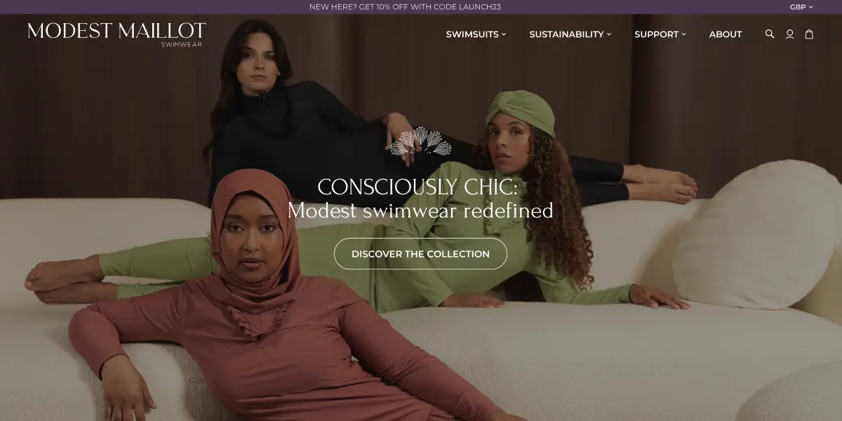
High-Performance Marketplace Redesign
Reworking the front- and backend of a Shopify-based modest female swimwear retailer, implementing best practices, and highlighting the overarching mission of the Client.

Reworking the front- and backend of a Shopify-based modest female swimwear retailer, implementing best practices, and highlighting the overarching mission of the Client.

Modest Maillot is a Belgian Apparel & Fashion B2C manufacturer and vendor of modest female swimwear that focuses on sustainability. They are an established luxury brand with a global market presence. Their mission lies in recycling every single strand of polyamide fabric they can put their hands on.
They came in with two major issues they wanted to address.
First, they wanted to improve their backend optimization. Their biggest pain point were the load times.
Second, they did not want a simple redesign. The Client had a clear objective in mind: to put more emphasis on their core values of sustainability and recycling.
Surprisingly, the biggest challenge was finding the flaws. As it was, the website was already pretty solid—the design was made professionally, and so was the backend. Plus, Shopify is a reliable platform, so looking for flaws was extra challenging.
However, there is always space for improvement.
With the scope and the budget established, our work on Modest Maillot began.

KEY OUTCOMES: <2.0s Load Time: Achieved "Green Zone" speed scores, down from 4+ seconds. 30% Conversion Uplift: Directly attributed to the faster, frictionless UX design. Reduced Bounce Rate: significantly improved engagement on mobile devices. Scalable Infrastructure: Enabled the onboarding of new vendor catalogs without performance degradation.
The project is far from over. So what’s next in store for Modest Maillot?

We have plenty of work planned for the Client’s Shopify store. The current website attracts plenty of visitors, but it could do better with a few improvements.
First, we wanted to redesign the vast majority of the pages to make them clearer and more attractive. The fonts and text placement could use a bit of work, so that’s what we’ll focus on next.
After that, the Client expressed their desire to add the blog section to allow them to better explain their mission and educate their visitors.
For now, that is all we have planned for Modest Maillot. But there is always something to be improved. So check back later to see how it turned out.
