Nowadays more than 50% of people worldwide have the experience of online shopping at least once in a lifetime. Over the years, the number of online purchases will only increase, which reflects what a powerful mainstream e-commerce is and how important the UX is.
Such tendencies make the number of products increase rapidly as well as the number of people going shopping online instead of going to the actual shop grows fast. With all the variety of shops and goods, it is getting harder and harder to drag shoppers attention and make him do a purchase.
The key to a successful development of online business is Design. We just recently talked about design, its importance and cost in our latest blog post. You will find it helpful if you want your web store to sell more.
10 totally awesome UX tips and tricks for the product page design
It is very important for the customer to see relevant and unique information about the product he is interested in. That’s why nicely built Product page is so сrucial. We collected 10 best UX tips for your awesome product page.
1. It’s all about the visuals
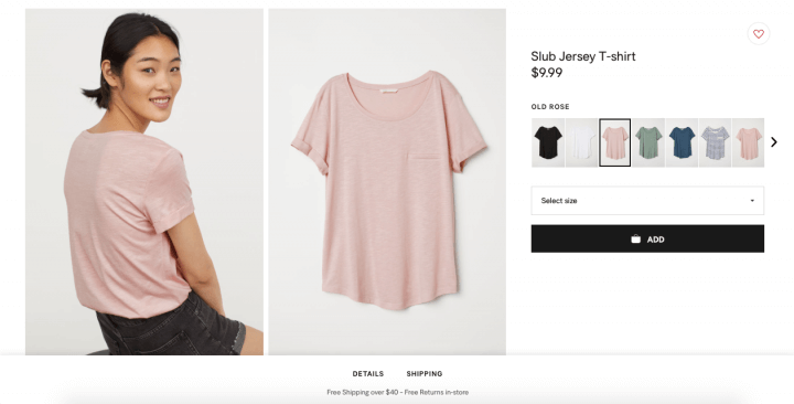
Nothing describes your product better than the good picture of it. Nothing else draws attention that much as the image does. That’s why it is the key point of your product.
The images should be of a high resolution, multiangular, which will help a customer to the see the product from many sides. Thus, the customer will get a feeling that he saw everything and nothing now can be a negative surprise for him. It is important to gain the trust of a buyer, so all the images should be relevant and live. Noone likes to be fooled. The other awesome tool is video. With video, you have more chances to tell your customer about your product, show its strongest advantages and create an emotional spark like “Wow!”. Do not hesitate to use videos.
Tip: use a plain background, so the main product contrasts with it. Put your product under the spotlight, so all the details are visible. If you sell clothes or cosmetics (make-up) show how they look on a body/face. If you are selling electronics — remove the background completely and add some good light (not even one), so the item looks sexier. That’s what Steve Job did once and Apple does until today.
Tricky, right?
2. Name it right
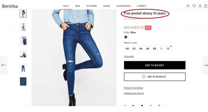
Most likely the customers will find something at your store by the name of the page. That’s why the right naming is so useful. The name of the product helps a visitor see find it while searching, as well as drag customer’s attention.
It’s another function not only to inform but to help Google see your web store and rank it higher. Some details about the product instead of just the short name will bring your product list higher if someone is searching for the same thing cheaper.
That’s a thing worth sharing, what do you say?
[socialShare_shortcode]
3. Appeal to ratio & emotio
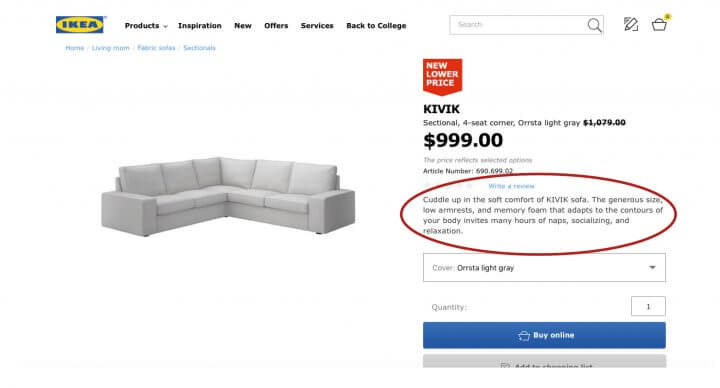
A customer tends to read more about the thing he is interested in. That’s your third chance to affect his decision to buy or not to buy. The purchases might be an emotional sudden decision as well as a well-thought before action. You never know, which one is your case, so try to appeal to both emotional and rational aspect of the decision-making process of a person in the product description.
Are you more of a rational or emotional buyer? Share in the comment, we would love to know that!
4. Money matters
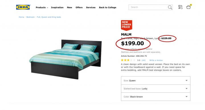
The price is a powerful tool to make an impact on a rational buyer. Money is the thing that matters almost all the time to all the customers, so make sure your price conduces to buy, not to abandon the page.
If you are sure about the price and it’s undercutting competitors place your price front and center, so it visible right away. It also helps to display old-new price. Such trick makes s person think, that the offer is more advantageous and limited in time. Thus, it induces a person to make a purchase.
It is better to indicate a price in the end after all the advantages and its unique features, if the amount is big itself, or you are not competing solely on price.
Have you ever seen those methods used before?
5. Drag attention and Call to ACTION!
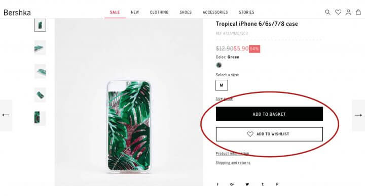
After a customer got acquainted with your product let him interact with it. So it as simple as one click by adding a call to action button. Those may be “Add to cart” or “Add to wishlist”. This button should be super easy to use and extremely visible. Make sure it’s easy clickable and the color of the button highlights it off the page in general.
That is one of the supreme features of Amazon.com. You should have heard of its 1-Click ordering, which is available since 1997! This technology places your order automatically and lets you skip the shopping cart. Thus, when you click the 1-click ordering button on any product page, your order will be automatically charged to the payment method and shipped to the address associated with your 1-Click settings. Wow, that’s fast and cool!
That was a good piece of advice. Worth sharing! So, here’s your call to action button. You know what to do with it:)
[socialShare_shortcode]
6. Delivery info
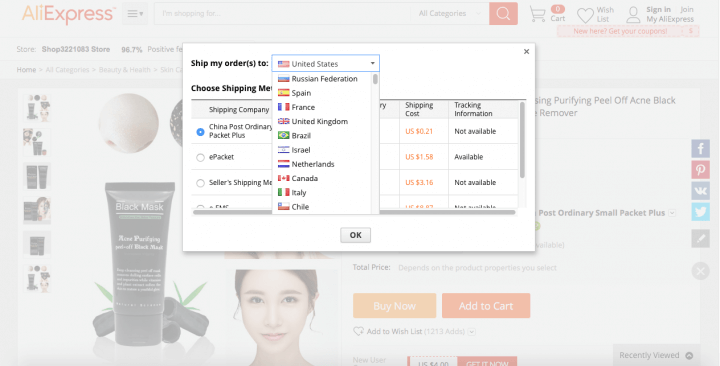
It happens sometimes that delivery costs more than a purchase. What a pity if customer figures that out the time he receives the parcel! Also, the absence of delivery info is #1 reason for the abandoned cart in the online shops.
To avoid this make sure you provide all the needed info for delivery. Tell your customer what could be the options, how much time it will take, what would be the approximate cost and if you ship worldwide. Deliver not only the product but the happiness and satisfaction to your customer. That will make him more loyal.
By the way, we recently had a blog post about how to increase customer’s loyalty. You will find it handy!
7. Let them spread a word
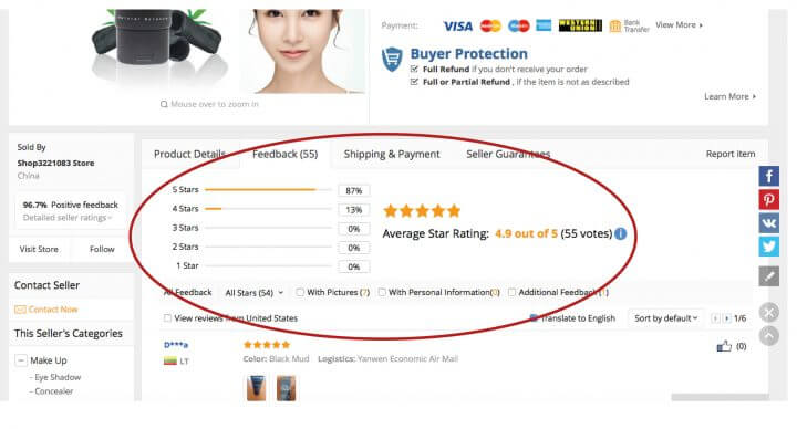
The trust is what makes people buy online without seeing the product in advance. It is common for online buyers to trust the word of others. So the best option is to supply people with high-quality products and encourage them to spread a word for you.
That’s what makes Amazon, Booking and many other sites so successful. Everyone knows, that if you need something — check on the reviews on Amazon, to make your decision. The same with Booking- once you are about to plan a trip — you have to check some comments and advice on the site. Thus, you will know which hotel is worth visiting, where the cashdesks work around the clock, and where better not to stop. Power of the word!
By the way, reviews do the product page UX design more interactive! So this is just one more reason to implement them.
Good reviews form positive reputation of your online business, so take care of that. Sometimes a good review matters much more than all your nice pictures and amazing descriptions.
8. Details for the most curious
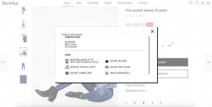
Seems like some customers are like hunters for the details. Let them find them, so they satisfy their eager to know everything about a product. You probably didn’t even think of it, but sometimes even the PDFs of the catalog pages might be helpful for a customer to tame his hunger for information.
Keep in mind, that those specifications are important, but not to everyone, so do not overwhelm all the customers with them. Those who need information will go to the link/side tab anyway and find the info.
Agreed?
9. Don’t let them leave
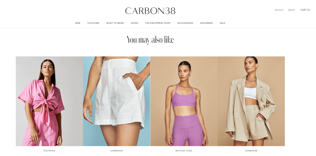
If a customer drops the interest in the item he was previously attracted by, most likely he will just close the tab with your online shop. What a sad story! What you have to do — don’t let them leave. How can you do it?
Show some related things, so the customer finds an alternative. Offer him to take a look at the most popular products in your shop — keep him interested in your shop, so all in all — he purchases a product. Or a couple of them.
Even if a customer ends up leaving with empty hands — it’s still better. It will help you bump your site engagement and search result stats.
10. Speed is crucial
People already spend a lot of time waiting. So waiting for a page to load is not the case, they are ready to give up on. Thus, a page has to be fast and responsive.
Laggy pages are making people leave without even taking a look at the product. As well as pages, that look crappy on the phones/tablets, since they are not responsive.
Put aside all the overly designed product pages, which kill customers’ patience. Make sure that everything loads fast enough and looks good on the mobile screen.
Product Pages UX Design: Summary
seems like you are all set, to make a check on your store, following these conversion-focused, visitor-driven UX elements. They will not only aid in perfecting your e-commerce design process but also will provide your customers with an ultimate e-commerce experience.
Make sure you check our blog since we are coming up with more useful UX tips for you!
If you have any questions — let us know!


